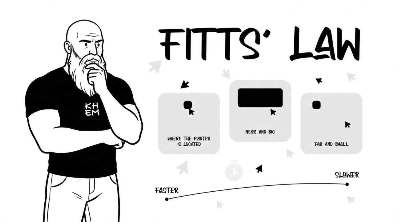
The time it takes to reach a target depends on two things:
how far it is and how big it is.
That’s it.
Closer and bigger = faster and easier.
Farther and smaller = slower and harder.
It sounds obvious, right? But obvious things are usually the ones people ignore. And in design… ignoring obvious truths is how you lose users. Ouch.
Fitts’ Law is not a “UX thing.” It’s a human thing.
Think about it.
Door handles are big and easy to grab. Why? Because your brain and body need quick, accurate interaction.
Emergency buttons are large and visible. You don’t want someone aiming like they’re playing darts in a crisis.
In restaurants, the most ordered dishes are usually highlighted or placed in easy visual reach. That’s cognitive proximity.
Even your phone screen corners? On desktop systems, corners are powerful because they’re infinitely targetable — you can slam your cursor there without overshooting. That’s not random. That’s physics meeting psychology.
As we say in Colombia:
If you make it tiny and far away… don’t complain when people miss it, mi hermano.
Now Let’s Bring It to Product Design (Where It Really Hurts)
In digital products, Fitts’ Law is a conversion machine — or a conversion killer.
Here’s where designers mess up:
❌ Small primary buttons
You design a beautiful CTA… but it’s tiny. The user has to aim like they’re threading a needle. Resultado: friction.
❌ Important actions far from thumb reach
On mobile, if your main action lives at the top corner, far from natural thumb zones… you’re fighting anatomy.
❌ Overcrowded interfaces
If every clickable element is small and close together, accuracy drops. Errors increase. Frustration grows.
And remember something critical from Universal Principles of Design:
Efficiency and usability improve when interactive targets are large enough and positioned strategically.
This is not about “aesthetic minimalism.”
It’s about respecting human motor behavior.
Practical Examples in Product Design
Let’s make this real:f
Primary CTA Buttons
Your “Buy Now” or “Continue” button should be:
Large
Clear
Easy to tap
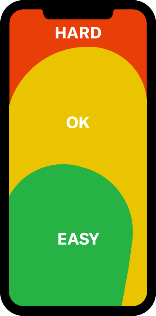
Positioned in natural thumb zones (especially mobile)
If the main action feels harder to hit than the “Cancel” button… we have a problem, parce.
Navigation in Apps
Bottom navigation bars exist for a reason:
Closer to thumb reach
Faster interaction
Less effort
Top-corner hamburger menus? They’re fine… but don’t make core actions live there.
Destructive Actions
Delete buttons should be:
Big enough to avoid mis-taps
Not too close to safe actions
Sometimes separated visually
Fitts’ Law is not just about speed — it’s also about preventing error.
Fitts’ Law teaches us something very human:
Design is not decoration. It’s movement.
When someone uses your product, their body is involved. Their hands. Their thumb. Their motor precision. Their cognitive load.
If interaction feels heavy, slow, or inaccurate… it’s not the user being clumsy.
It’s the design ignoring human physics.
And as we say in Medellín and Barranquilla alike:
No le eches la culpa al usuario. Revise el diseño.
Great design reduces effort.
Great design respects distance and size.
Great design makes important actions easy and unimportant actions secondary.
If everything is small and equally placed… nothing is truly prioritized.
So next time you design a screen, ask yourself:
Is the most important action the easiest to reach?
Is the interaction physically comfortable?
Am I designing for aesthetics… or for real human behavior?
Because in product design, the fastest path wins.
And if your button is tiny and hiding in the corner… well… don’t be surprised when nobody clicks it.
Design for humans. Not for screenshots.
And please… make the button bigger.